
According to research by the University of North Carolina’s School of Media and Journalism (UNCSMJ) almost one in five newspapers has shuttered since 2004. This equates to almost 1,800 weekly and daily papers. Since that time numerous publications have disappeared, been sold to venture capital firms, and shrunk in size. The loss of those publications means more than just a loss of local coverage.
Many factors have led to this situation. This project concerns itself with where the news deserts exist and who is impacted. What is the cost to society when publications disappear? In 2020 most people are hyper focused on national politics. While what happens at the national level has an effect on our daily lives we are more affected by our local community. Local press serves as the only watchdog of local/ state government. Local journalists live in the communities they cover and serve both as the watchdog and the region promoter.
The Nieman Lab performed a study of one hundred randomly sampled local newspapers in 2019 to determine the impact local newspapers have on the rest of the media ecosystem. While making up roughly 25% of the local media market the newspaper was responsible for nearly 50% of all local news, 60% of local stories, and 38% of critical need stories. The local newspaper outperformed the local radio, tv, and online-only publications in covering their local community combined.
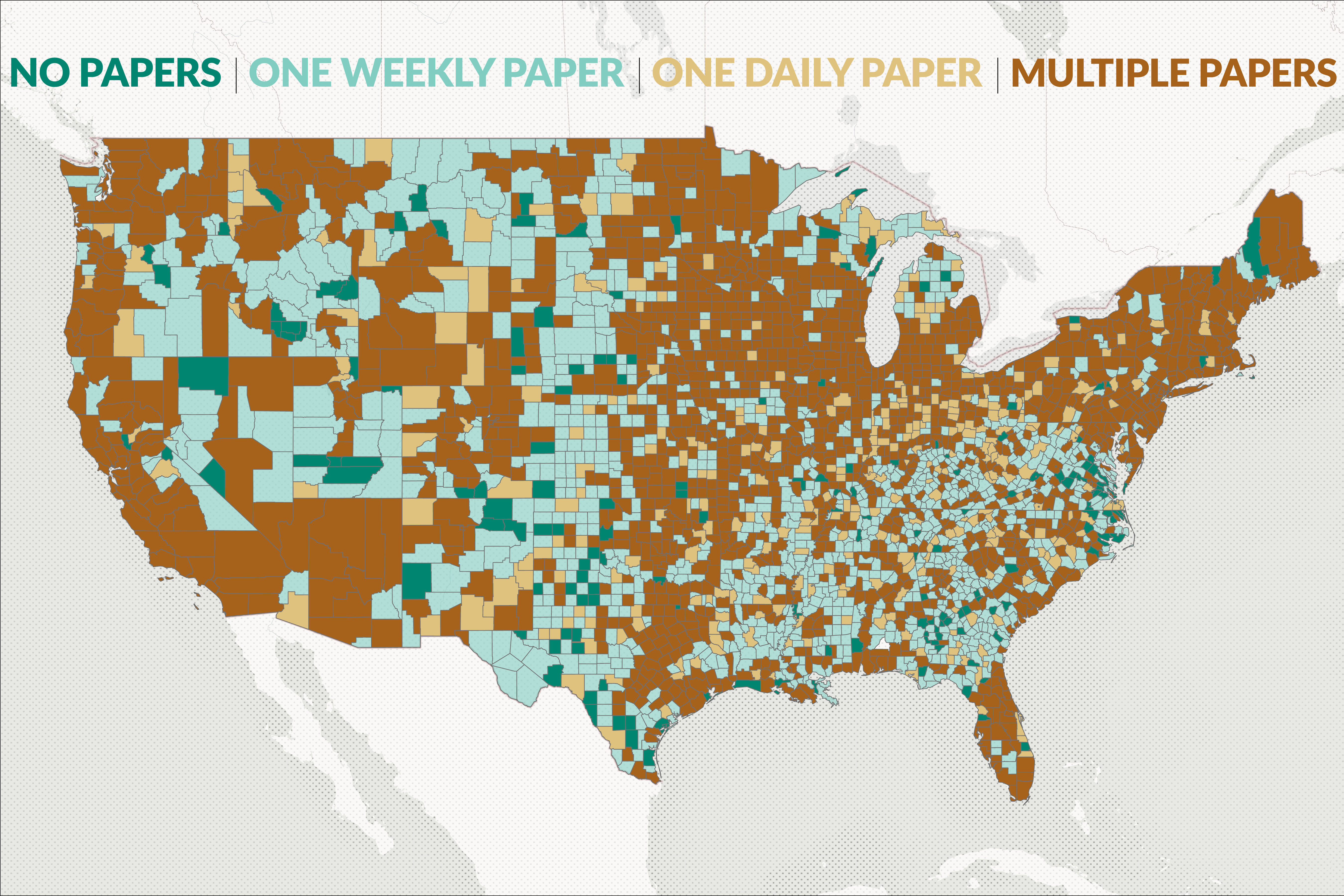
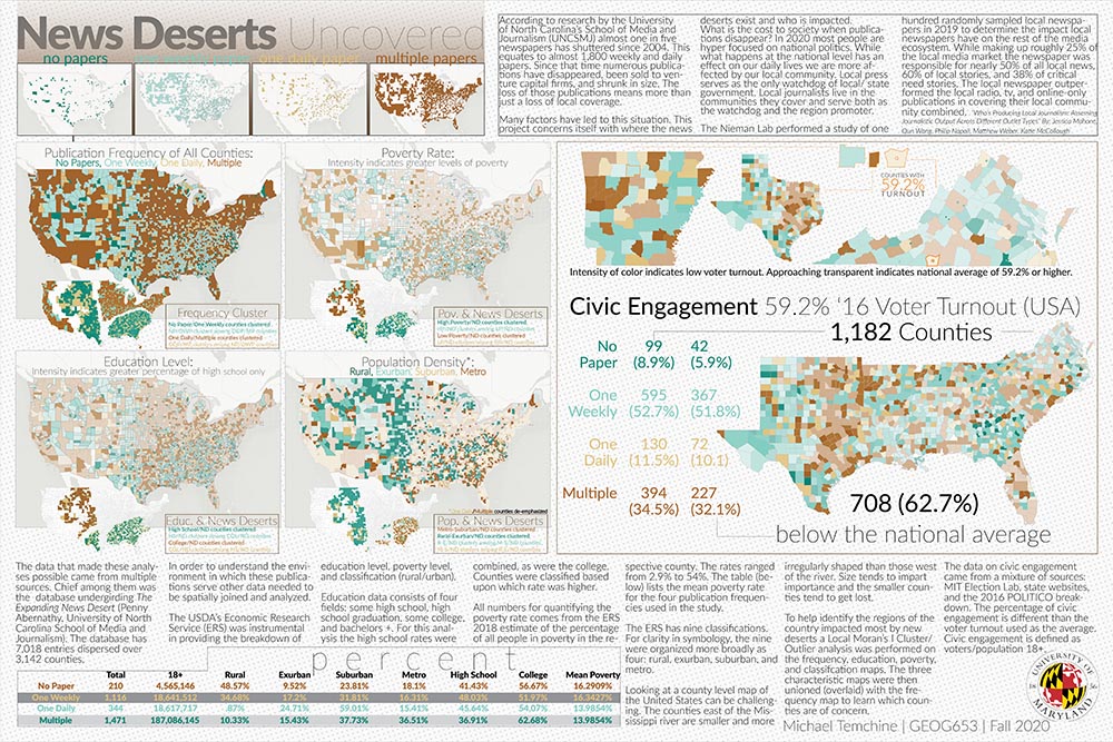
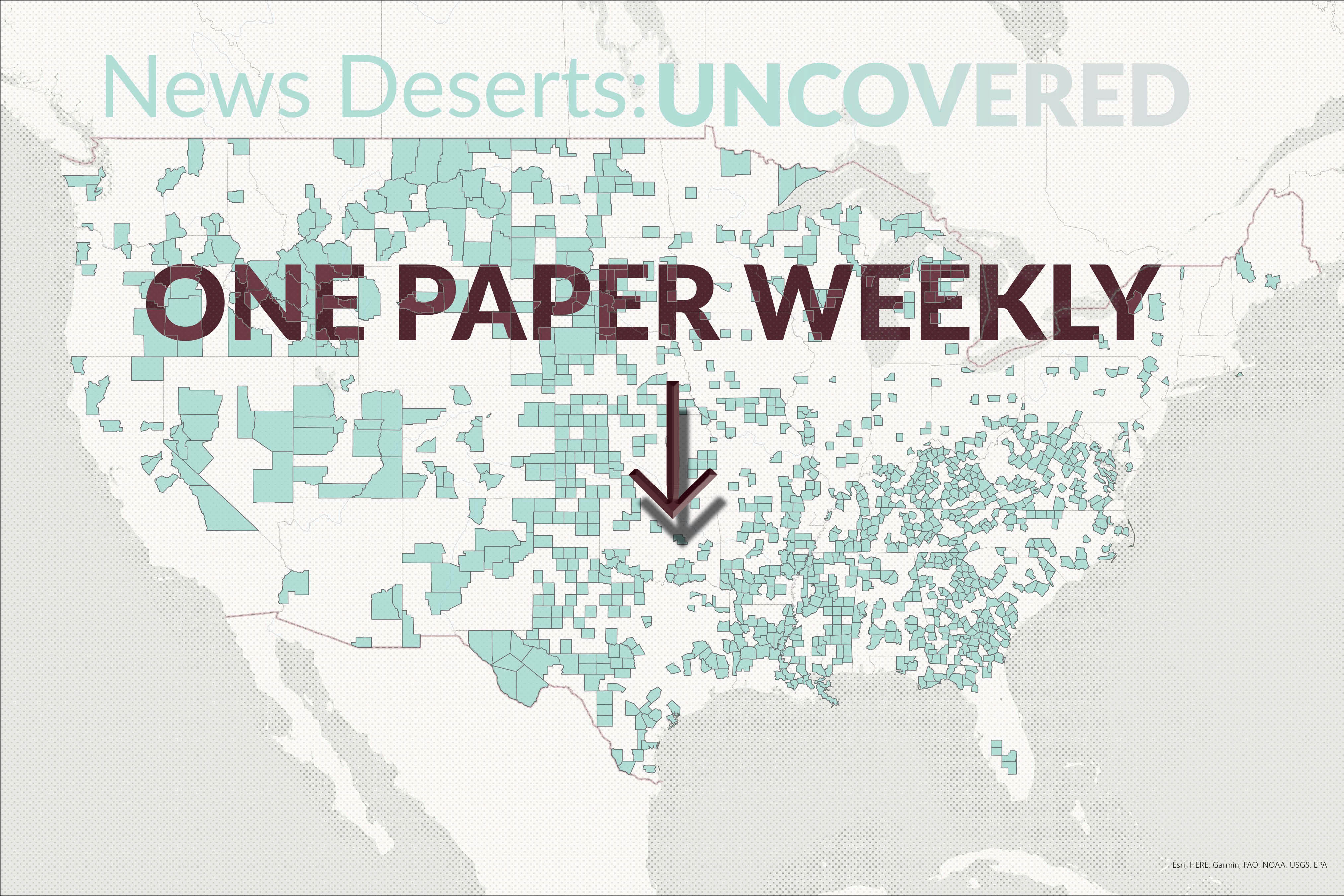
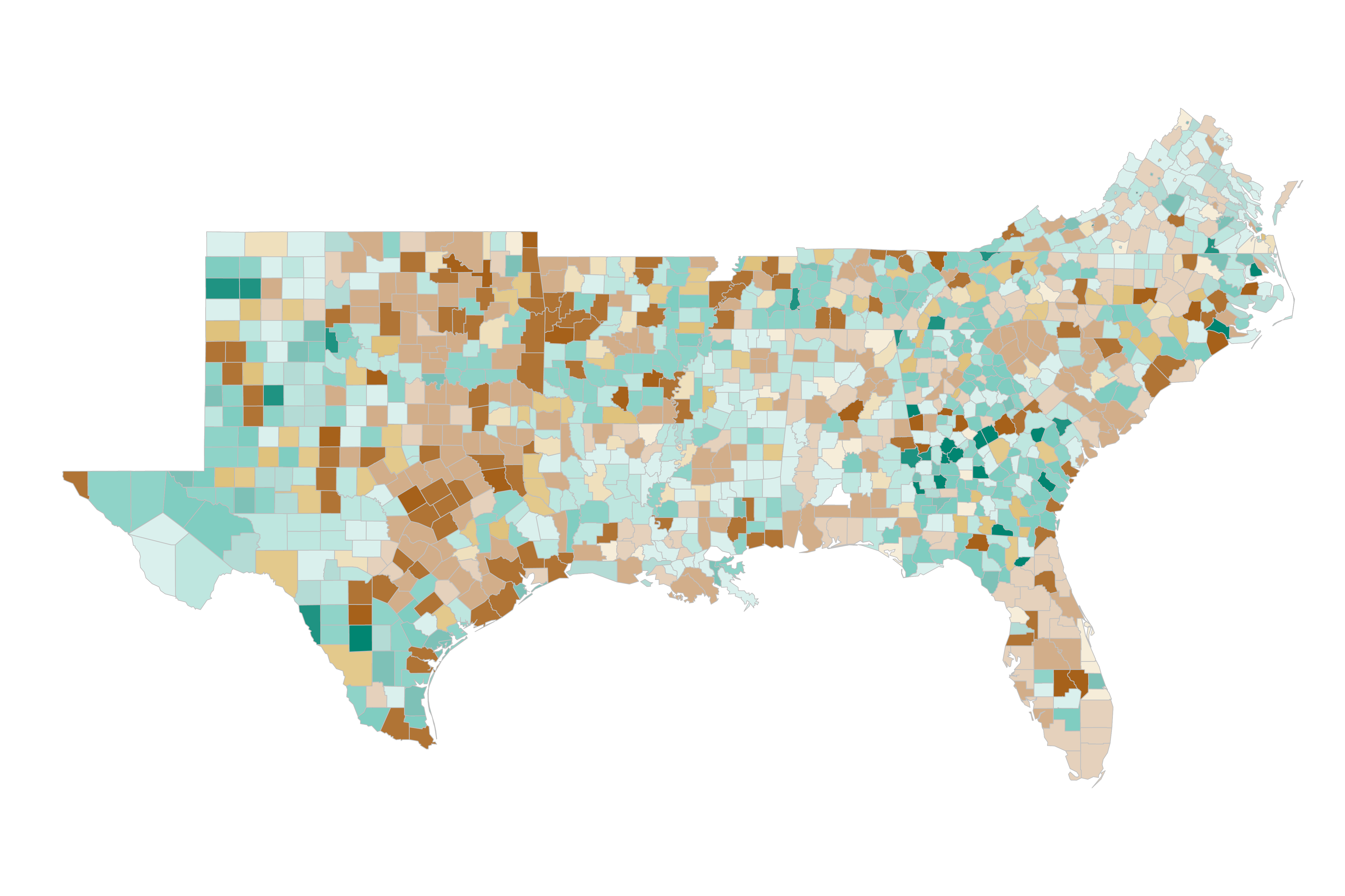
Counties that border each other and share a trait, education level for example, are considered clustered. Outliers are counties that diverge from the surrounding clusters. The education, poverty, and population density cluster maps overlay the News Desert cluster map and indicate the counties that qualify as a News Desert (no paper or one weekly paper) and the second trait. Viewing clusters allows us to understand the regions most affected. For the sake of clarity, clusters of counties that have at least one daily paper are not shown.
99 | 8.9%
42 | 5.9%
595 | 52.7%
367 | 51.8%
130 | 11.5%
72 | 10.1%
394 | 34.5%
227 | 32.1%
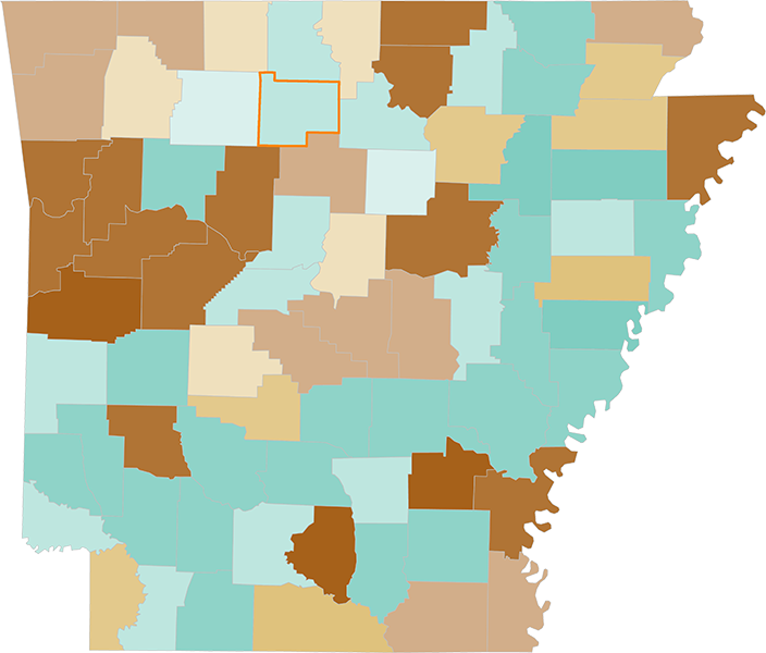
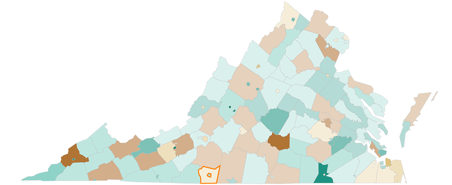
Arkansas, Texas, and Virginia represent a cross section of the south regarding turnout, with Virginia having having the highest in the region. The counties outlined in orange indicate the national turnout average of 59.2%. Counties with less saturation had turnout greater than this and counties with greater saturation of color had lower.

210 |
4,565,146 |
9.52% |
23.81% |
18.1% |
41.43% |
56.67% |
16.29% |
||
1,116 |
18,641,512 |
34.68% |
17.2% |
31.81% |
16.31% |
51.97% |
|||
344 |
18,617,717 |
.87% |
15.41% |
45.64% |
54.07% |
13.98% |
|||
10.33% |
15.43% |
37.73% |
36.91% |
13.98% |
The data that made these analyses possible came from multiple sources. Chief among them was the database undergirding The Expanding News Desert (Penny Abernathy, University of North Carolina School of Media and Journalism). The database has 7,018 entries dispersed over 3,142 counties. In order to understand the environment in which these publications serve other layers data needed to be spatially joined and analyzed. The USDA’s Economic Research Service (ERS) was instrumental in providing the breakdown of education level, poverty level, and classification (rural/urban).
Education data consists of four fields: some high school, high school graduation, some college, and bachelors+. For this analysis the high school rates were combined, as were the college. Counties were classified based upon which rate was higher. All numbers for quantifying the poverty rate comes from the ERS 2018 estimate of the percentage of all people in poverty in the respective county. The rates ranged from 2.9% to 54%. The table lists the mean rate for the four publication frequencies used in the study.
The ERS has nine classifications. For clarity in symbology, the nine were organized more broadly as four: rural, exurban, suburban, and metro. Looking at a county level map of the United States can be challenging. The counties east of the Mississippi river are smaller and more irregularly shaped than those west of the river. Size tends to impart importance and the smaller counties tend to get lost.
To help identify the regions of the country impacted most by new deserts a Local Moran’s I Cluster/Outlier analysis was performed on the frequency, education, poverty, and classifcation maps. The three characteristic maps were then unioned (overlaid) with the frequency map to learn which counties are of concern. The data on civic engagement came from a mixture of sources: MIT Election Lab, state websites, and the 2016 POLITICO breakdown. The percentage of civic engagement is different than the voter turnout used as the average. Civic engagement is defined as voters/population 18+.