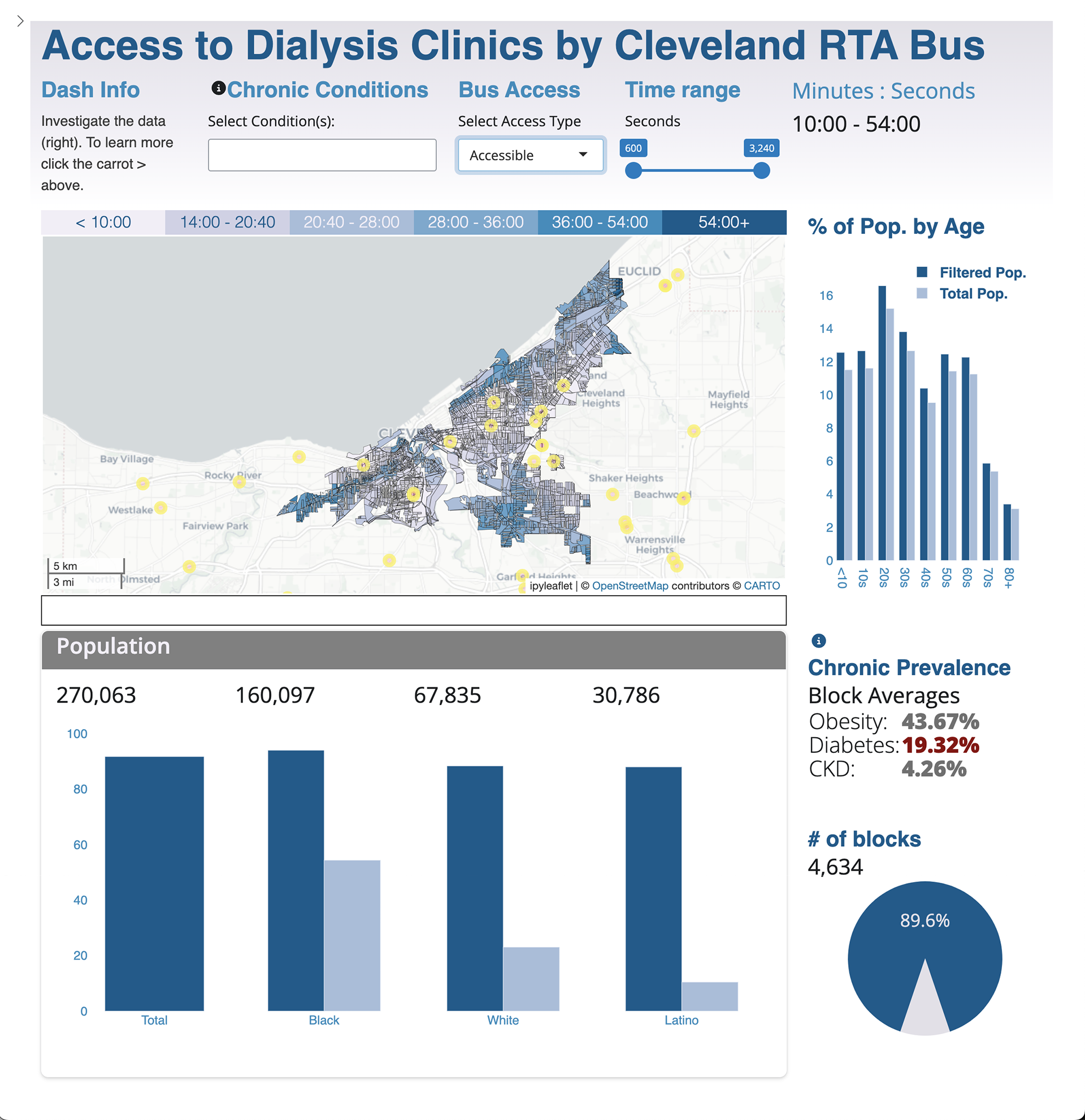
Dashboard designed with Shiny for Python using Leaflet and hosted on shinyapps.io. The dashboard offers a selection of demographic information on the citizens that live in Health Provider Shortage Areas (HPSA) as defined by the Department of Health and Human Services. HPSAs are so designated because they lack access to medical care. Most HPSAs in urban environments are comprised of poor residents with little access to a personal vehicle and therefore must rely upon public transportation to reach clinics.
People with End State Renal Disease (ESRD) travel frequently to dialysis centers and if you do not have a car the burden of making your appointments is great. To better understand this burden the analysis determined the average time it would take to reach the nearest dialysis center by walking no more than 10 minutes plus the bus travel time. Some areas, accounting for 10% of the Census blocks and 8.3% of the population living in an HPSA, cannot access a center at all in this manner.
Click on the image to interact with the dashboard live.
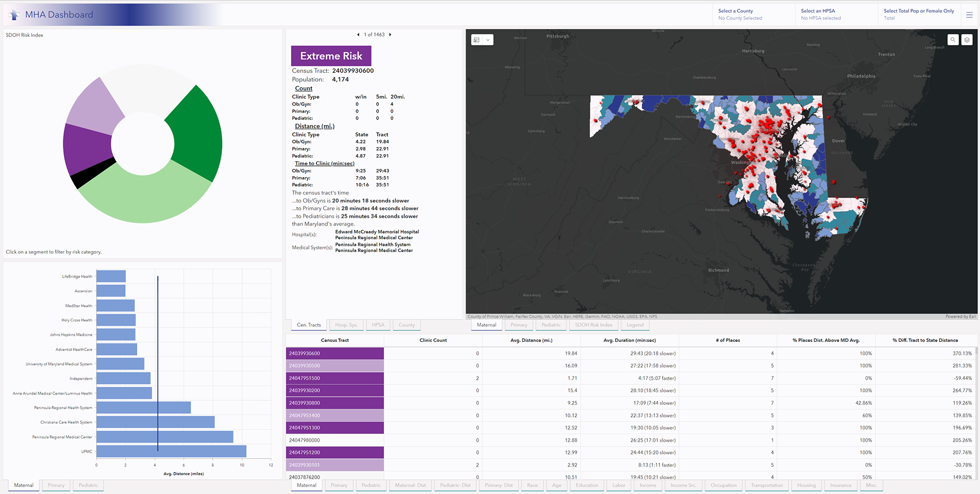
A dashboard designed for the Maryland Hospital Association to understand communities that lack access to ob/gyn, primary, and pediatric care at the Census tract, zip code, and county levels. Included in the analysis are the hospital catchment areas and HPSA medically underserved communities. Access to care is determined by both driving distance and driving times aggregated to each admin level. Social determinant of health data is included in the table and HSR.health's SDOH risk index that indicates a tract's risk is also integrated into the dashboard. Each part of the dashboard interacts with the others and it includes three category filters for searching by county, HPSA, and to control whether the table shows total population data or data for women only. Learn more about this dashboard at the tutorial I created in the tutorial section.